Histogram events & bin hover label improvements #2113
There are no files selected for viewing
| Original file line number | Diff line number | Diff line change |
|---|---|---|
|
|
@@ -458,12 +458,12 @@ describe('hover info', function() { | |
| }); | ||
| }); | ||
|
|
||
| function _hover(gd, xpx, ypx) { | ||
| Fx.hover(gd, { xpx: xpx, ypx: ypx }, 'xy'); | ||
| Lib.clearThrottle(); | ||
| } | ||
|
|
||
| describe('\'hover info for x/y/z traces', function() { | ||
| it('should display correct label content', function(done) { | ||
| var gd = createGraphDiv(); | ||
|
|
||
|
|
@@ -501,6 +501,128 @@ describe('hover info', function() { | |
| }); | ||
| }); | ||
|
|
||
| describe('hover info for negative data on a log axis', function() { | ||
| it('shows negative data even though it is infinitely off-screen', function(done) { | ||
| var gd = createGraphDiv(); | ||
|
|
||
| Plotly.plot(gd, [{x: [1, 2, 3], y: [1, -5, 10]}], { | ||
| yaxis: {type: 'log'}, | ||
| width: 500, | ||
| height: 400, | ||
| margin: {l: 0, t: 0, r: 0, b: 0} | ||
| }) | ||
| .then(function() { | ||
| _hover(gd, 250, 200); | ||
| assertHoverLabelContent({ | ||
| nums: '\u22125', // unicode minus | ||
| axis: '2' | ||
| }); | ||
| }) | ||
| .catch(fail) | ||
| .then(done); | ||
| }); | ||
| }); | ||
|
|
||
| describe('histogram hover info', function() { | ||
| it('shows the data range when bins have multiple values', function(done) { | ||
| var gd = createGraphDiv(); | ||
|
|
||
| Plotly.plot(gd, [{ | ||
| x: [0, 2, 3, 4, 5, 6, 7], | ||
| xbins: {start: -0.5, end: 8.5, size: 3}, | ||
| type: 'histogram' | ||
| }], { | ||
| width: 500, | ||
| height: 400, | ||
| margin: {l: 0, t: 0, r: 0, b: 0} | ||
| }) | ||
| .then(function() { | ||
| _hover(gd, 250, 200); | ||
| assertHoverLabelContent({ | ||
|
There was a problem hiding this comment. Would mind checking that There was a problem hiding this comment. Good catch -> tested in 2696c1c |
||
| nums: '3', | ||
| axis: '3 - 5' | ||
| }); | ||
| }) | ||
| .catch(fail) | ||
| .then(done); | ||
| }); | ||
|
|
||
| it('shows the exact data when bins have single values', function(done) { | ||
| var gd = createGraphDiv(); | ||
|
|
||
| Plotly.plot(gd, [{ | ||
| // even though the data aren't regularly spaced, each bin only has | ||
| // one data value in it so we see exactly that value | ||
| x: [0, 0, 3.3, 3.3, 3.3, 7, 7], | ||
| xbins: {start: -0.5, end: 8.5, size: 3}, | ||
| type: 'histogram' | ||
| }], { | ||
| width: 500, | ||
| height: 400, | ||
| margin: {l: 0, t: 0, r: 0, b: 0} | ||
| }) | ||
| .then(function() { | ||
| _hover(gd, 250, 200); | ||
| assertHoverLabelContent({ | ||
| nums: '3', | ||
| axis: '3.3' | ||
|
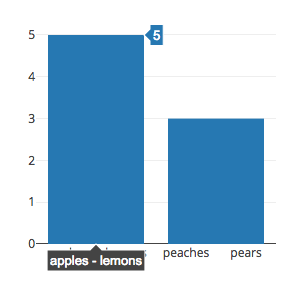
There was a problem hiding this comment. Note: for histogram2d I applied this independently to each axis, not to each brick. So if one x brick has only the point (2, 3) and one above it has only the point (2.1, 4), this will make the x bins show ranges, because that one x bin has multiple values, even though each brick has unique values in it. There was a problem hiding this comment. Nice touch here. I was worried that category histograms would get e.g, There was a problem hiding this comment. That can happen - but only if the bins actually contain apples and lemons. Plotly.newPlot(gd, [{
x: ['apples','apples','apples','lemons','lemons','peaches','peaches','pears'],
type: 'histogram',
xbins: {start: -0.5, end: 3.5, size: 2}
}],{
width: 400,
height: 400
})
It's possible to put as many categories as you want into one bin, and as with numbers we'll only show the first and last ones in the label. Never happens automatically since it's in general confusing, but if you want to do it we won't stop you! There was a problem hiding this comment.
Cool. Would you mind adding a test case for this situation? There was a problem hiding this comment.
|
||
| }); | ||
| }) | ||
| .catch(fail) | ||
| .then(done); | ||
| }); | ||
| }); | ||
|
|
||
| describe('histogram2d hover info', function() { | ||
| it('shows the data range when bins have multiple values', function(done) { | ||
| var gd = createGraphDiv(); | ||
|
|
||
| Plotly.plot(gd, [{ | ||
| x: [0, 2, 3, 4, 5, 6, 7], | ||
| y: [1, 3, 4, 5, 6, 7, 8], | ||
| xbins: {start: -0.5, end: 8.5, size: 3}, | ||
| ybins: {start: 0.5, end: 9.5, size: 3}, | ||
| type: 'histogram2d' | ||
| }], { | ||
| width: 500, | ||
| height: 400, | ||
| margin: {l: 0, t: 0, r: 0, b: 0} | ||
| }) | ||
| .then(function() { | ||
| _hover(gd, 250, 200); | ||
| assertHoverLabelContent({ | ||
| nums: 'x: 3 - 5\ny: 4 - 6\nz: 3' | ||
| }); | ||
| }) | ||
| .catch(fail) | ||
| .then(done); | ||
| }); | ||
|
|
||
| it('shows the exact data when bins have single values', function(done) { | ||
| var gd = createGraphDiv(); | ||
|
|
||
| Plotly.plot(gd, [{ | ||
| x: [0, 0, 3.3, 3.3, 3.3, 7, 7], | ||
| y: [2, 2, 4.2, 4.2, 4.2, 8.8, 8.8], | ||
| xbins: {start: -0.5, end: 8.5, size: 3}, | ||
| ybins: {start: 0.5, end: 9.5, size: 3}, | ||
| type: 'histogram2d' | ||
| }], { | ||
| width: 500, | ||
| height: 400, | ||
| margin: {l: 0, t: 0, r: 0, b: 0} | ||
| }) | ||
| .then(function() { | ||
| _hover(gd, 250, 200); | ||
| assertHoverLabelContent({ | ||
| nums: 'x: 3.3\ny: 4.2\nz: 3' | ||
| }); | ||
| }) | ||
| .catch(fail) | ||
| .then(done); | ||
| }); | ||
| }); | ||
|
|
||
| describe('hoverformat', function() { | ||
| var data = [{ | ||
| x: [1, 2, 3], | ||
|
|
||
There was a problem hiding this comment.
Choose a reason for hiding this comment
The reason will be displayed to describe this comment to others. Learn more.
Thanks for 🔒 ing this down!