Skip to content

Turn finance charts into first-class trace types #2510

New issue

Have a question about this project? Sign up for a free GitHub account to open an issue and contact its maintainers and the community.

By clicking “Sign up for GitHub”, you agree to our terms of service and privacy statement. We’ll occasionally send you account related emails.

Already on GitHub? Sign in to your account

Closed
nicolaskruchten opened this issue Mar 29, 2018 · 4 comments
Closed

Turn finance charts into first-class trace types #2510

nicolaskruchten opened this issue Mar 29, 2018 · 4 comments
Assignees
Labels
bug something broken

Comments

@nicolaskruchten
Copy link
Contributor

The following Pen shows an issue with a sequence of Plotly.react calls not meshing well with candlestick charts: https://codepen.io/nicolaskruchten/pen/qooWqr

@alexcjohnson alexcjohnson added the bug something broken label Mar 29, 2018
@alexcjohnson
Copy link
Collaborator

Update: This is an issue with Plotly.react but NOT with Plotly.restyle. I spent a couple of hours fighting with it before concluding (after talking with @etpinard) that my time would be better spent turning candlestick and OHLC into first-class chart types instead of transform hacks. I'm not even going to look at #2508 until this is done, because the OHLC transform hacks are so different from our other transforms that the framework will be far easier to reason about and fix once they're gone. Anyway this is a change we've been discussing for ages and will allow us to fix several more otherwise-intractable bugs.

While investigating this I found a different class of errors, that may or may not impact plotly.js directly but will definitely impact the editor and perhaps other apps: traces mutating the "public" parts of _full(Data|Layout) outside of the supplyDefaults framework: either:

  • adding new properties that look like attributes (because they aren't prefaced with _) but are not
  • reshaping an existing attribute, as when we reshape 1D Z arrays into 2D
  • filling in auto values only during calc and NOT writing them back to data and layout - this means if you make a small change to the plot that doesn't trigger calc, these quantities will disappear from _full* and will not be available to the editor.

I've fixed many of these, and explicitly ignored the others in the relevant test (this one, where we draw and then redraw a plot with Plotly.react and verify that nothing was done; now I'm also testing that fullData and fullLayout are unchanged in their supposedly public portions), so that the problem is at least bounded.

@alexcjohnson alexcjohnson self-assigned this Apr 4, 2018
@alexcjohnson alexcjohnson changed the title Plotly.react sequence candlestick Turn finance charts into first-class trace types Apr 4, 2018
@alexcjohnson
Copy link
Collaborator

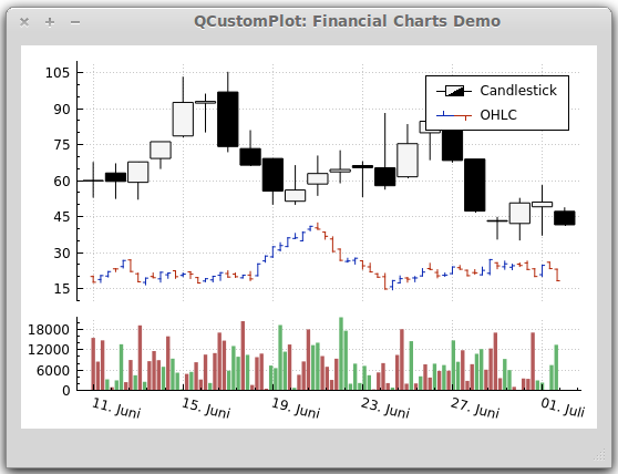
This will give us the freedom to make custom legend symbols for candlestick and OHLC, rather than just using the box and scatter line symbols. And to collapse them into a single item, rather than one for increasing and another for decreasing. Here's about the only example I see of this in a quick image search:
https://stackoverflow.com/questions/21223501/market-price-charts-in-qt
wcwc3
I like it, any comments? @chriddyp @cldougl @charleyferrari? Seems concise and clear which color is increasing/decreasing. But I'm open to tweaks.

Currently we have two legend entries, each with its own name. Those names would go away if I make this change, and I'll probably have to do something hacky in cleanData to combine them if we have increasing/decreasing names but not a base trace name. It's not possible currently to toggle off just one direction - if you click either legend item they both disappear. So from that standpoint we're free to collapse to a single legend item.

@alexcjohnson
Copy link
Collaborator

Incidentally, I came across this page that has a whole bunch of variants on candlestick charts, that we will suddenly be free to add as new features once these are their own trace type http://stockcharts.com/school/doku.php?id=chart_school:chart_analysis:arms_candlevolume
In particular, check out this one that uses color (black/red) to denote whether the closing price is higher or lower than the previous day, and filling (closed/open) to denote whether the price increased or decreased during the day
armscv-4-can-isrg

@chriddyp
Copy link
Member

chriddyp commented Apr 4, 2018

Seems concise and clear which color is increasing/decreasing. But I'm open to tweaks.

A single legend item seems good to me and that legend item symbol looks good to.
I'll also defer to @santosjorge for feedback on this

Sign up for free to join this conversation on GitHub. Already have an account? Sign in to comment
Labels
bug something broken
Projects
None yet
Development

No branches or pull requests

3 participants