-
-
Notifications
You must be signed in to change notification settings - Fork 18.4k
xticks missing for scatter plots with colors #10611
New issue
Have a question about this project? Sign up for a free GitHub account to open an issue and contact its maintainers and the community.
By clicking “Sign up for GitHub”, you agree to our terms of service and privacy statement. We’ll occasionally send you account related emails.
Already on GitHub? Sign in to your account
Comments
|
Thanks for the report. Strange, may be related to the order or method of ax, plot and colorbar creation...? We should specify the occurrence condition. |
|
I was checking previous versions of Pandas and I can confirm that the bug starts in 0.16.1 and it is still in 0.16.2 |
|
I hit this bug as well (0.16.2), and I can confirm that this problem appears only with |
|
as a quick workaround use |
|
|
|
Still an issue in 0.20.3 |
|
@dr-1 PR's to fix are welcome. or event a simple repro on 20.3, as this issue is still open |
|
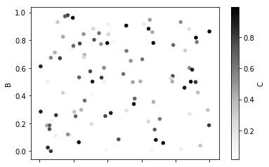
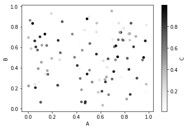
I encountered this bug also. See screenshots of the two versions of the plot, one with colors, one without. The full notebook (without output, as it's still WiP) is at: http://go.gwu.edu/engcomp2lesson4 |
|
I'm having this issue in pandas 0.22.0 running in Jupyter notebook. Would it solve the issue to hardcode |
|
Hardcoding @tacaswell maybe you have a quick answer. With import matplotlib.pyplot as plt
import numpy as np
x = np.arange(20)
y = np.sin(x)
c = np.hstack([np.ones_like(x[:10]) * 0.25,
np.ones_like(x[10:]) * 0.75])
fig, ax = plt.subplots()
sc = ax.scatter(x, y, c=c, cmap='viridis')
plt.colorbar(mappable=sc, ax=ax, ticks=[0, 0.25, 0.5, 0.75, 1.0]);Is there any way to disable the update done to the x axis ticks (not sure if it's the tick labels or something else) in the With matplotlib that gives with pandas gives |
|
For reference, here's the MPL code that we're calling: pandas/pandas/plotting/_core.py Lines 872 to 877 in 8a58303
|
|
Not sure if this is a duplicate, but I dug a bit deeper into the code. It is happening in _handle_shared_axes. If you comment the following line the issue disappears: pandas/pandas/plotting/_core.py Line 255 in 8a58303
it seems to stem from this line: pandas/pandas/plotting/_core.py Line 426 in 8a58303
I tried running the code from within _core.py to explore this more closely. Compare this: with this: |
|
@javadnoorb thanks for looking. So your suspicion is that if we excluded the newly created colorbar axes from |
|
FWIW, extracting the colorbar axes may be a tad difficult, but we should be able to hack something together. |
|
That's my guess @TomAugspurger. I vaguely remember that I extracted colorbar axes before, and as you said it was not very straightforward. I'll look more into this within the next couple of days and will get back to you. |
|
FWIW, we're creating the colorbar axes, and we control every method here, so as a last resort you could add a private attribute like |
|
That's a good idea. |
|
No idea, but probably :)
IIRC, the only other code we have is from hexbin. I don't recall if it
shares an implementation with scatter.
…On Mon, Mar 19, 2018 at 11:02 AM, Javad Noorbakhsh ***@***.*** > wrote:
That's a good idea. _handle_shared_axes seems to be just a few for loops
through the axes, so that would probably resolve this. Could that conflict
with other subplottings with colorbars?
—
You are receiving this because you were mentioned.
Reply to this email directly, view it on GitHub
<#10611 (comment)>,
or mute the thread
<https://github.com/notifications/unsubscribe-auth/ABQHIgEbRNHB71-i_VE7m0_eJ67RrS7vks5tf9aZgaJpZM4Fa7yI>
.
|
|
@TomAugspurger I'm going through this code. You're right. Extracting colorbars is not very easy. I think what you suggested with the private attribute is the way to go. The issue as far as I can tell is that axes are matploltlib objects, so I don't know of any clean way to define a private attribute for them without inheritance. Any ideas? We also need to be careful with pandas/pandas/plotting/_tools.py Line 299 in 8a58303
It loops through all axes and uses _remove_labels_from_axis to remove the axis label unless it is the last row/column or sharex/sharey=False. Simply skipping the colorbar axes wouldn't solve the problem, because by default when sharex=True, _remove_labels_from_axis will be applied to the axis anyway. However it only loops through axes if there are more than one rows/columns. So one solution I can think of is:
This won't mess up with multiplots (although we might want to do the same to ncols as well?). But it's a bit hacky. Any better solution you can think of? A second way to deal with this might be to alter layout: pandas/pandas/plotting/_tools.py Line 308 in 8a58303
whenever there is only one non-colorbar axis. Beside scatter, colorbars seem to only be used by hexbin, and they don't seem to share any code except through PlanePlot. Their colorbar implementation is very similar. So I think resolving the issue with scatter should similarly affect hexbin. |
|
The above hacks I was thinking of assume that we're dealing with a single scatterplot with a single colorbar. A more general solution to deal with multiple subplots will require more work. |
|
The hack I had in mind was getting the new cbar ax from and then directly adding a Then in the _handle_shared_axes we'll skip axes where |
|
Interesting. I didn't know it was possible to assign attributes to objects in python. That's a pretty nice feature! |
|
It's rightly considered a hack :)
…On Tue, Mar 20, 2018 at 8:20 AM, Javad Noorbakhsh ***@***.***> wrote:
Interesting. I didn't know it was possible to assign attributes to objects
in python. That's a pretty nice feature!
—
You are receiving this because you were mentioned.
Reply to this email directly, view it on GitHub
<#10611 (comment)>,
or mute the thread
<https://github.com/notifications/unsubscribe-auth/ABQHIjtF4v2V4mJu7re3L3qWzHpuP_u3ks5tgQIkgaJpZM4Fa7yI>
.
|
|
I like it! I think skipping I think we need something like |
|
I’m not sure. I don’t even know what the interaction of a color at and subplots is.
…________________________________
From: Javad Noorbakhsh <[email protected]>
Sent: Tuesday, March 20, 2018 8:50:32 AM
To: pandas-dev/pandas
Cc: Tom Augspurger; Mention
Subject: Re: [pandas-dev/pandas] xticks missing for scatter plots with colors (#10611)
I like it!
I think skipping getattr(ax, '_pandas_colorbar_axes', False) will avoid removing tick labels from all the axes except for colorbars. So it will interfere with subplots if there are multiple plots. Don't you think?
I think we need something like axarr=[ax for ax in axarr if getattr(ax, '_pandas_colorbar_axes', False)] and corresponding changes to nplots, naxes, nrows, ncols in the first line of _handle_shared_axes
—
You are receiving this because you were mentioned.
Reply to this email directly, view it on GitHub<#10611 (comment)>, or mute the thread<https://github.com/notifications/unsubscribe-auth/ABQHIpYA7E_Sokl_jS-RPgQYuj-ewf_Rks5tgQkngaJpZM4Fa7yI>.
|
|
@TomAugspurger, I made your suggested changes in my own fork: seems to be working fine: Will probably require more testing. But I've never done this. What's the proper testing procedure before PR? |
|
Ideally you'd write a test that fails without your changes, apply the
changes, and then make sure the test passes with your changes.
But feel free to make a PR whenever.
…On Wed, Mar 21, 2018 at 8:15 PM, Javad Noorbakhsh ***@***.***> wrote:
@TomAugspurger <https://github.com/tomaugspurger>, I made your suggested
changes in my own fork:
https://github.com/javadnoorb/pandas
seems to be working fine:
%matplotlib inline
import numpy as np
from mypandas import pandas as pd
df = pd.DataFrame(np.random.random((1000,3)),columns=['A','B','C'])
df.plot.scatter('A','B',c='C');
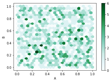
df.plot.hexbin('A','B', gridsize=25);
[image: image]
<https://user-images.githubusercontent.com/26352146/37745615-256baf16-2d4c-11e8-97b5-2ec4a4ceb835.png>
[image: image]
<https://user-images.githubusercontent.com/26352146/37745631-3eedf016-2d4c-11e8-88cd-d3b47a000b7f.png>
Will probably require more testing. But I've never done this. What's the
proper testing procedure before PR?
—
You are receiving this because you were mentioned.
Reply to this email directly, view it on GitHub
<#10611 (comment)>,
or mute the thread
<https://github.com/notifications/unsubscribe-auth/ABQHImDiQktbntZM0QS5AyFoSJ1xpliIks5tgvsdgaJpZM4Fa7yI>
.
|
|
So @javadnoorb has submitted #20446, but I notice that with matplotlib 2.2.2 I'm getting the correct output on pandas master (without @javadnoorb's fix). Would the people in this thread mind updating to matplotlib 2.2.2 and try out this code: import matplotlib.pyplot as plt
import numpy as np
import pandas as pd
x = np.arange(20)
y = np.sin(x)
c = np.hstack([np.ones_like(x[:10]) * 0.25,
np.ones_like(x[10:]) * 0.75])
ax2 = pd.DataFrame({'x': x, 'y': y, 'c': c}).plot.scatter(x='x', y='y', c='c', cmap='viridis');My figure has the xaxis visible |
|
I upgraded to matplotlib 2.2.2 and still get the old result (without x-axis label). @TomAugspurger are you running this in Jupyter notebook? |
|
I was not. I'd forgotten that it was just for the inline backend. Nevermind
then.
…On Fri, Mar 30, 2018 at 8:42 AM, Javad Noorbakhsh ***@***.***> wrote:
I upgraded to matplotlib 2.2.2 and still get the old result?
@TomAugspurger <https://github.com/TomAugspurger> are you running this in
Jupyter notebook?
—
You are receiving this because you were mentioned.
Reply to this email directly, view it on GitHub
<#10611 (comment)>,
or mute the thread
<https://github.com/notifications/unsubscribe-auth/ABQHIluRDrEV9sXwGg1XU5zGHUTK4HYiks5tjjY5gaJpZM4Fa7yI>
.
|
|
I had forgotten too. But I think this is an issue. I suspect the tests we've written for the PR are going to always pass. We need tests to run with inline backend. |
|
This was resolved in the master for a while but seems to have returned since 0.24.0. Example code: %matplotlib inline
import numpy as np
import pandas as pd
random_array = np.random.random((1000, 3))
df = pd.DataFrame(random_array,columns=['A label','B label','C label'])
df.plot.scatter('A label', 'B label', c='C label')I think the culprit is: pandas/pandas/plotting/_core.py Line 833 in d3c9d6e
Note that this only happens in the inline backend. Output of
|
|
I am having the same issue |
|
Same here, executing from a Jupyter Notebook (I haven't fully understood whether it is important or not) with Matplotlib version greater than 3.0 (3.0.3). Pandas version is 0.24.2. I have tried forcing the workaround highlighted by @javadnoorb but it didn't change anything for me. Edit : My bad, just printing the two figures one above the other made me realise that it was maybe just the width missing. I put a larger |
|
I hit this bug as well, and I found a solution that add one ax. https://stackoverflow.com/questions/52631031/make-pandas-plot-show-xlabel-and-xvalues |


example: https://www.wakari.io/sharing/bundle/adamgreenhall/test-scatter
I think this happens specifically for pandas scatter plots with colorbars in ipython. The xticks are still working for:
plt.savefigrelated problem with
%matplotlib inline?: ipython/ipython#1443The text was updated successfully, but these errors were encountered: