-
-
Notifications
You must be signed in to change notification settings - Fork 1.9k
Traces inside rangeslider do not stack vertically for stacked subplots #2172
New issue
Have a question about this project? Sign up for a free GitHub account to open an issue and contact its maintainers and the community.
By clicking “Sign up for GitHub”, you agree to our terms of service and privacy statement. We’ll occasionally send you account related emails.
Already on GitHub? Sign in to your account
Comments
|
So should it always do that? (not obvious to me) |
|
Related: #2010 |
The only case I can see for not doing it is if the y axis ranges for all of the subplots are the same, so maybe it should be optional. |
|
I feel like the range slider should always mirror exactly the y layout of the subplots it's controlling - seems like it would be nonintuitive to see traces overlaid there but not on the main plot. The only case I can see where you might not want the y ranges in the range slider to match what's on the main plot is if we implement autorange to visible data (see #1876 (comment)) - then you might want the range slider to keep the full y autorange (because that's the visible data there) even as the main plot zooms in to smaller y ranges. |
|
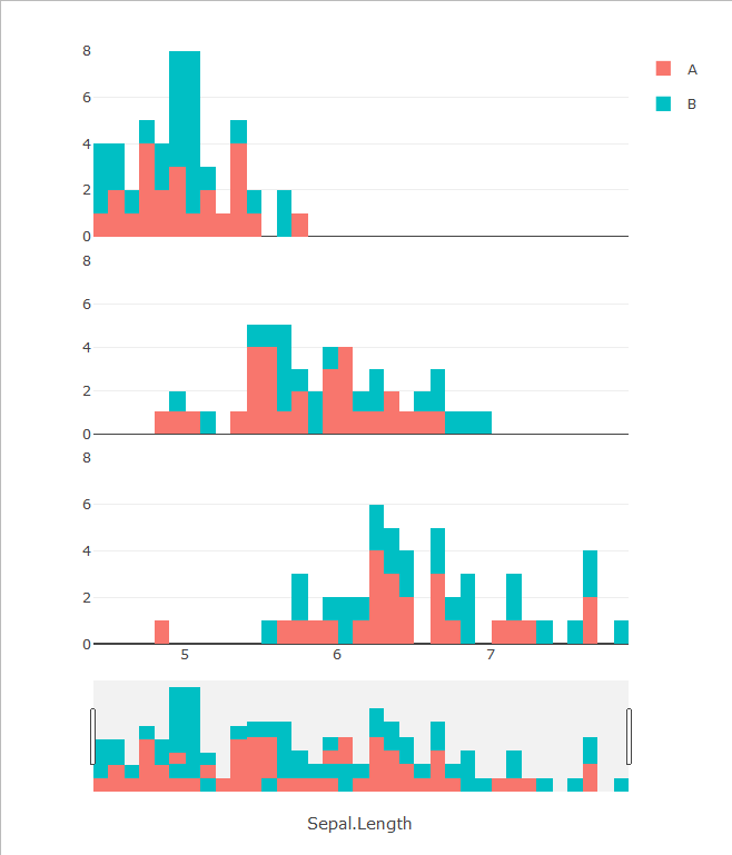
I have another example to add, this time with histograms. Consider this arrangement made with the iris dataset (using R & plotly): The rangeslider below shows a weird mix between the subplots. In fact, if you examine it closely, it's just the superposition of the three plots, resulting in this kind of things: Compare this to the same data in one stacked histogram: IMO, the rangeslider for the multiple stacked-histogram plot should look either like the one in the last example or simply a histogram of the whole dataset with just one color. Even when there's only 1 color, the histogram shown in the rangeslider should stack the bars of the subplot instead of simply putting one over the others. |
|
Hi - this issue has been sitting for a while, so as part of our effort to tidy up our public repositories I'm going to close it. If it's still a concern, we'd be grateful if you could open a new issue (with a short reproducible example if appropriate) so that we can add it to our stack. Cheers - @gvwilson |


Here's an example:
The rangeslider here should have its own 5 "subplots" so that the traces are ordered vertically in the same way.
This is going to very nice combined with vertical line hover spanning subplots:
#2155
The text was updated successfully, but these errors were encountered: