Improve styling of dialogs to avoid unwanted layout shift when scaling up the application #1309
Comments
|
If this is not related, I'd like to open another issue specifically for this, but I have noticed throughout the release candidates that when you maximize the main window before it is fully loaded, the entire window content will be drawn using the initial dimensions using startup, leaving the rest blank. Now as I am typing this and want to reproduce this, I just cannot do that successfully. I am using cdeb502. Maybe it was related to the deprecated themes. In case anyone else knows about this (this being caused by the themes or experiencing the issue), please leave a comment. Otherwise I guess this particular thing is just fixed. |
|
@InstantMuffin that bug is being tracked here: #1244 A fix was made for it in #1255, before which I believe it was easier to reproduce. I produced it by chance yesterday, so I know it is still possible, but I did not reproduce it after that so I think either the time window for making the resize is very specific or else there are additional undetermined required conditions. If you encounter it again, and especially if you find a way to reproduce it reliably, please comment on #1244 |
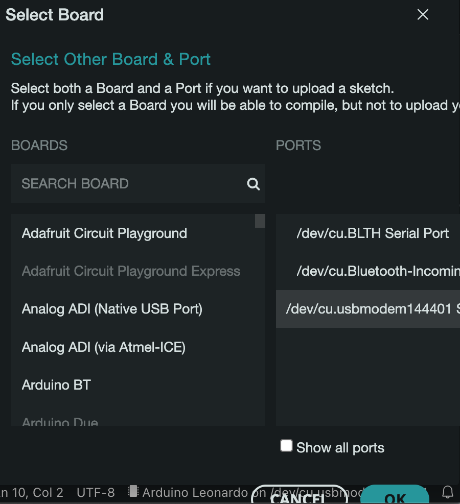
We've noted that the layouts of some dialogs in the IDE2 become distorted (with buttons going offscreen), when scaling up the application.
We should add css rules to ensure dialog layout shifts that impair usability do not occur on scaling up the app. Generally speaking our dialogs should have a fixed header and footer, content between should not overflow and push things out of view.
We should review all dialogs at different scales in the IDE2, we can group simpler dialogs that share rules into single PR, and use separate PRs for more complex dialogs (like the board / port selector).
Example of distorted board selector dialog when app is scaled up and the window width is reduced:
The text was updated successfully, but these errors were encountered: